Key Data Science

RSS
Jun
27

Data Viz at the Museum

I recently spent a weekend getaway in the Low Countries. Saturday started with a trip to Zeeland mainly to admire sea defences and dykes. I also visited Watersnoodmuseum a fascinating place housed in four grey concrete blocks caissons, half-sunk in the ground at uneven angles. On Sunday I travelled to Antwerp. It was mainly to visit MAS museum, a must-see attraction for everyone. Great exhibitions, amazing architecture and spectacular views at the viewpoint.

One of the exhibitions – Antwerp a la carte – was a big attention-grabber for me. Firstly, it was about food and secondly, it contained some really neat data visualisations.

Compelling graphs that showed places where food came from to Antwerp over time:

“Above all else show the data” ― Edward R. Tufte

Go in and see Antwerp a la carte you won’t regret it!

Data Viz Comments Off on Data Viz at the Museum
May
04

Data Visualisation Tools

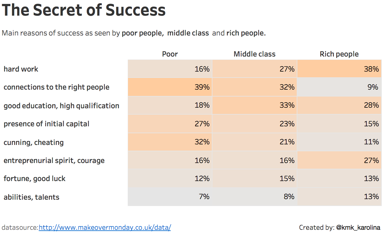
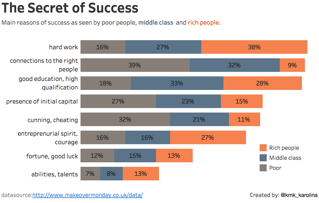
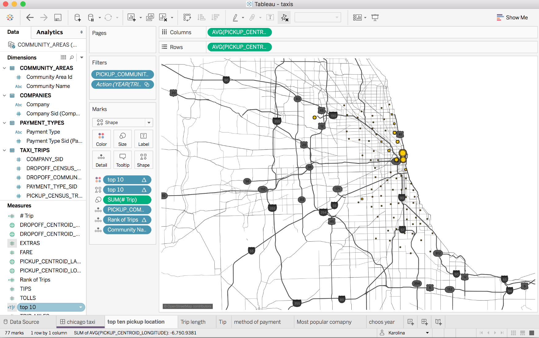
On my return flight from the data driven holidays, I looked into the next Makeover Monday challenge. It was about Sydney ferries and I did a small Tableau dashboard which was meant to look like a ferry announcement poster.

See it for yourself here.

Once I got that out of my way I wondered how easy it would be to accomplish a similar task in other data visualisation tools out there (it was a 4 hours flight so 3.5 hours to spare). I had all the other tools on my laptop so why not turn whatever it is into tasks and get crackin’!
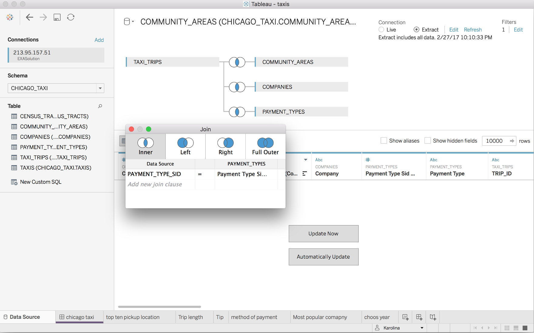
Tableau

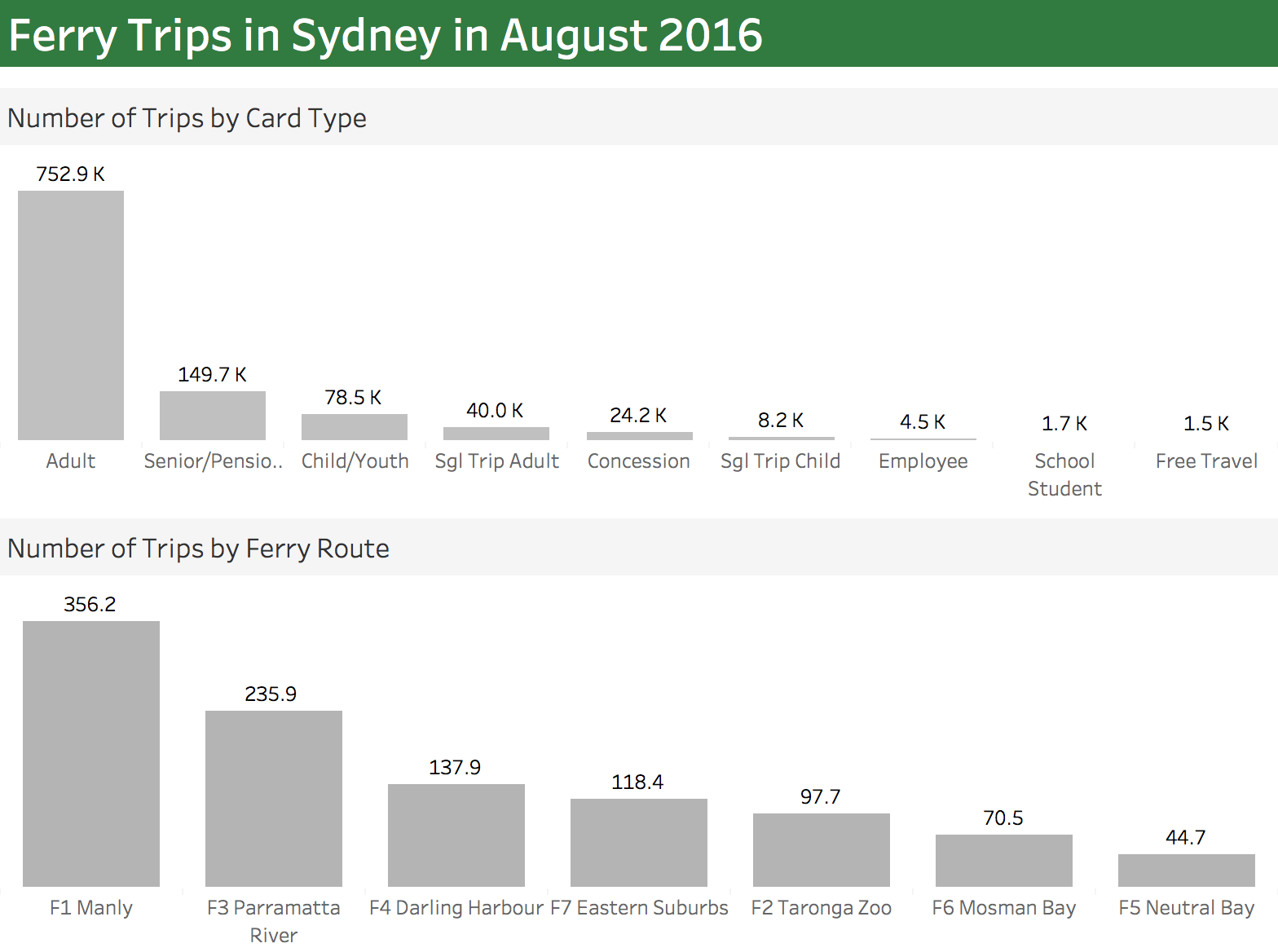
I decided to create a second and simpler dashboard in Tableau that could be used as a baseline. It took me only 5 minutes to complete.

Power BI

Next step was to recreate it in Power BI (using the data provided for the Makeover Monday in an Excel file). Well, things got off to a bad start. I immediately run into a problem when trying to upload the excel file to Power BI:

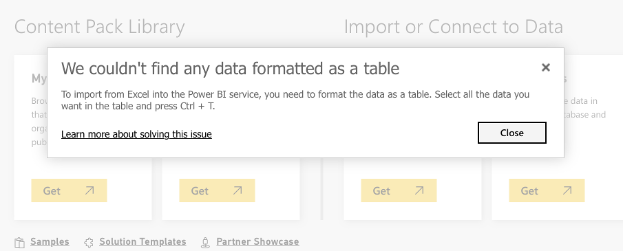
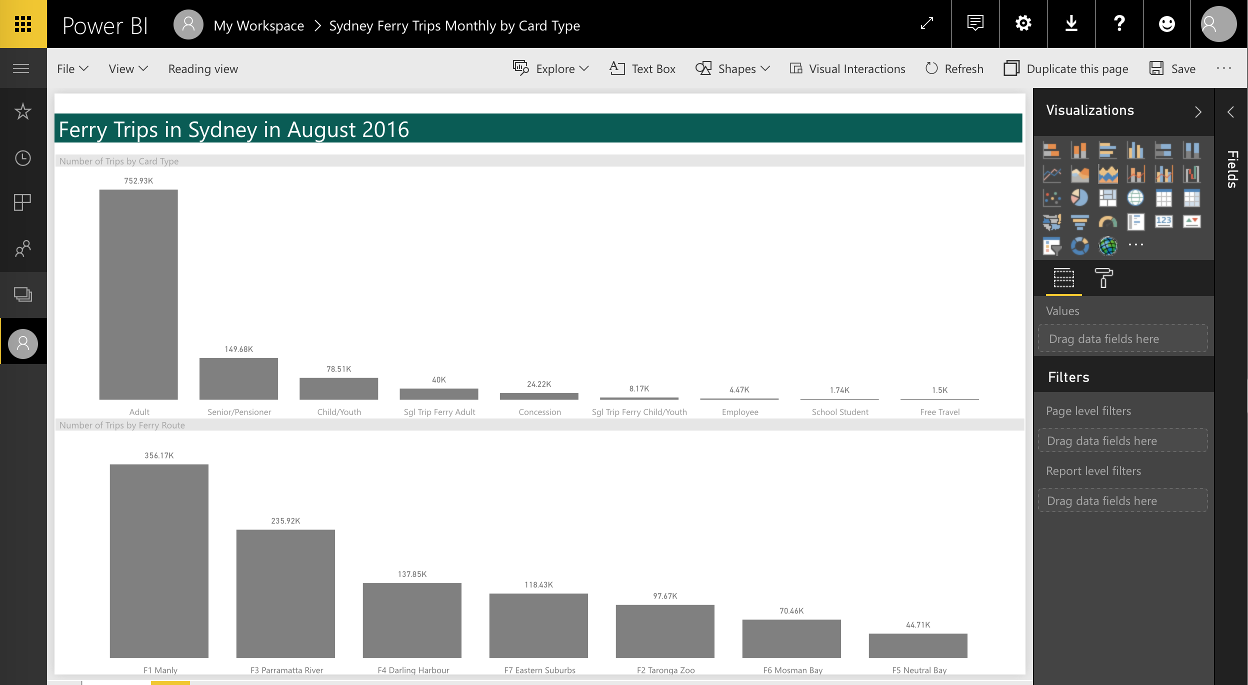
Nothing major but it looks like the data has to be formatted with a table style in Excel. Not very practical and confusing to users. With the style, format corrected the second attempt was indeed successful. Creating a copy of the first dashboard was a straightforward task and took me less than 10 minutes (including the formatting). That’s not bad for a tool which I don’t use very often.

I have a free version but the visualisation capabilities are exactly same as in the pro version. The main differences are in the data refresh and collaboration capabilities. Although my sample dashboard was a basic one you can create more complex reports as shown here.

While ago I had to use a REST API as the data source for Power BI. Surprisingly it did work. I used the desktop Power BI but run into some interesting authentication issues as the tool failed to pick up the authentication cookie. I resolved the problem with a custom HTTP header jiggery–pokery. Personally, I would prefer something that gives you a way to write a custom authentication script instead.

All in all, I think it’s a nice tool for ad-hoc data visualisations. If you have loads of Excel and CSV files flying around and want to do something with these quickly it’s definitely the right choice. If you want something more complicated – well you will quickly run into multiple snags.

QuickSight

The last data visualisation tool I had in mind was Amazon QuickSight. It’s been available from mid-November 2016.  I attempted to recreate the same dashboard again. I imported the CSV file into QS. This time it took me a bit longer complete. I gave myself 30 minutes which is a lot for a quick and easy dashboard like this one.  I used all the allocated time stubbornly trying (and failing) to achieve the same look and feel.

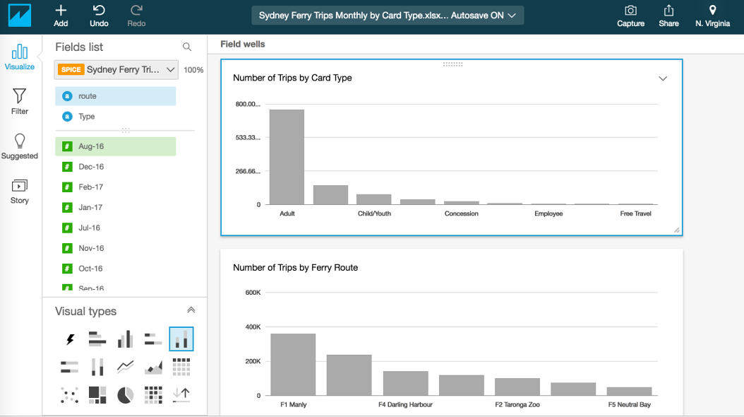
QuickSight is a new kid on the block and there’s plenty of things that could be improved in terms of visualisation and formatting. I wasn’t able to figure out how to add labels to bars in 30 minutes which shows that the tool is not the most user-friendly.  Also, I could not find out how to remove the grid lines in the rows. I hope that similar problems will be fixed and improved in the future versions.

I think the biggest selling point is the speed at which the BI can be brought to end user. It took me less than 5 minutes to start it and load the data. Another benefit is a good integration with other Amazon services like S3 or Redshift. As everything on Amazon, it can scale easily and scale fast. The pricing is also sensible.

All in all, it seems like a good tool for a quick and not too complicated visualisation. As for more advanced things I am not too sure yet.  Well, I still have a couple of days left in the free trial so I’m going do something more challenging next time and report back.

Data Viz Comments Off on Data Visualisation Tools
Mar
31

Déjà vu

I had a feeling of déjà vu when I saw this week’s Makeover Monday dashboard.

On the left, you have the Makeover Monday graph (http://visual.ly/secret-success) and on the right a graph from ‘Show me the numbers‘. The latter was used as a sample in the book to demonstrate how not to do visualisations.

I agree with the author that a spider chart is confusing. Often a simple solution like presenting the data in a table works better. I decided to experiment with two simple approaches and prepared a table and a bar chart.

It’s now clear that both visualisations are much more readable than the spider graph.

Which one is better? Well, that’s up to you to decide.

Data Viz Comments Off on Déjà vu
Mar
21

Show me the numbers

If the statistics are boring, then you’ve got the wrong numbers *” or the numbers are shown in the wrong way. I’ve been going through ‘Show me the numbers‘ book by Stephen Few. It’s a very enlightening read on data presentation techniques. The first chapter says that graphs should not be flashy but informative. Graphics need not dominate a presentation, but rather highlight the notable points.

I decided to makeover one of my earlier MakoverMondays dashboards and apply the guidelines.

It was:

…and now, using waffle charts it looks like this:

The waffle chart is nothing more but a square pie chart. I’m aware it’s a bit controversial topic (more on this here), but in some cases provides a nice visual way of communicating percentages.

Charts like these are a form of communication, but the chart must be comprehendible by those you are communicating with, be they senior management, your peers or the general public. In any group, the population is diverse, hence you should strive to appeal to all levels. I feel the second dashboard does the job much better now.

Conclusion: No matter how I show the numbers men are always better off 😉

* Edward R. Tufte

Books, Data Viz Comments Off on Show me the numbers
Feb
28

Data visualisations with Tableau

I’ve been recently taking part in Makeover Mondays.  It’s an exciting challenge and an excellent way to improve your Tableau skills whenever you have some spare time. The Chicago Taxis challenge was one of the most enjoyable to complete. It offered a live Exasol connection to all 105 million records. The Exasol is an in-memory database, and I must admit it works like a charm with Tableau.

Tableau gives you a nice visual interface for join data sets. It’s very user-friendly especially for beginners and works pretty well compared to other reporting tools I’ve used. tableau1

What’s not so great about Tableau is the way it treats custom SQL. I come from DBA background and can write efficient SQL queries much faster than I can click things on the GUI. Despite the fact that Tableau accepts custom SQL it’s not something recommended and surprisingly tends to be slower to fetch data. I guess that’s due to the way Tableau refactors the query in the background. I noticed that the query is issued inside of a subquery which often leads to poor performance.

Tableau has a pretty good map functionality. It’s great but still slightly limited.  Only the US region has the most detailed built-in maps. But there’s an option to use a custom geocoding, add own map layers should you want to.

The recently released version 10.2  (28 Feb 17)  comes with much improved geo-mapping capabilities. I’m eager to upgrade and take it for a spin.

tableau2

The dashboards are highly interactive and it makes the data presented very visually attractive.

chicago taxis

The only downside of Tableau is that it doesn’t run on Linux and I use Linux as my main desktop.

Data Viz, Tableau Comments Off on Data visualisations with Tableau