Data visualisations with Tableau
I’ve been recently taking part in Makeover Mondays. It’s an exciting challenge and an excellent way to improve your Tableau skills whenever you have some spare time. The Chicago Taxis challenge was one of the most enjoyable to complete. It offered a live Exasol connection to all 105 million records. The Exasol is an in-memory database, and I must admit it works like a charm with Tableau.
Tableau gives you a nice visual interface for join data sets. It’s very user-friendly especially for beginners and works pretty well compared to other reporting tools I’ve used. 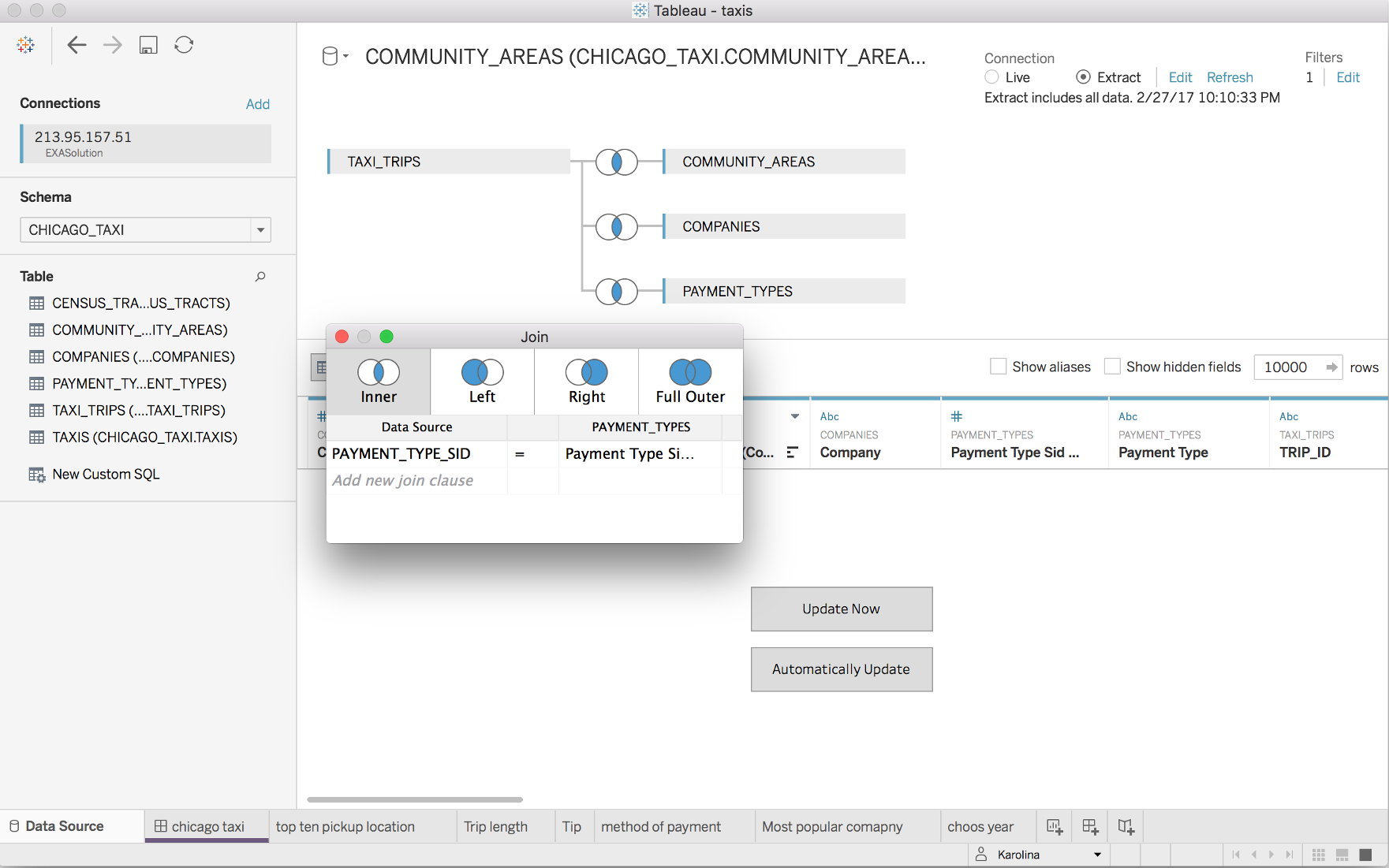
What’s not so great about Tableau is the way it treats custom SQL. I come from DBA background and can write efficient SQL queries much faster than I can click things on the GUI. Despite the fact that Tableau accepts custom SQL it’s not something recommended and surprisingly tends to be slower to fetch data. I guess that’s due to the way Tableau refactors the query in the background. I noticed that the query is issued inside of a subquery which often leads to poor performance.
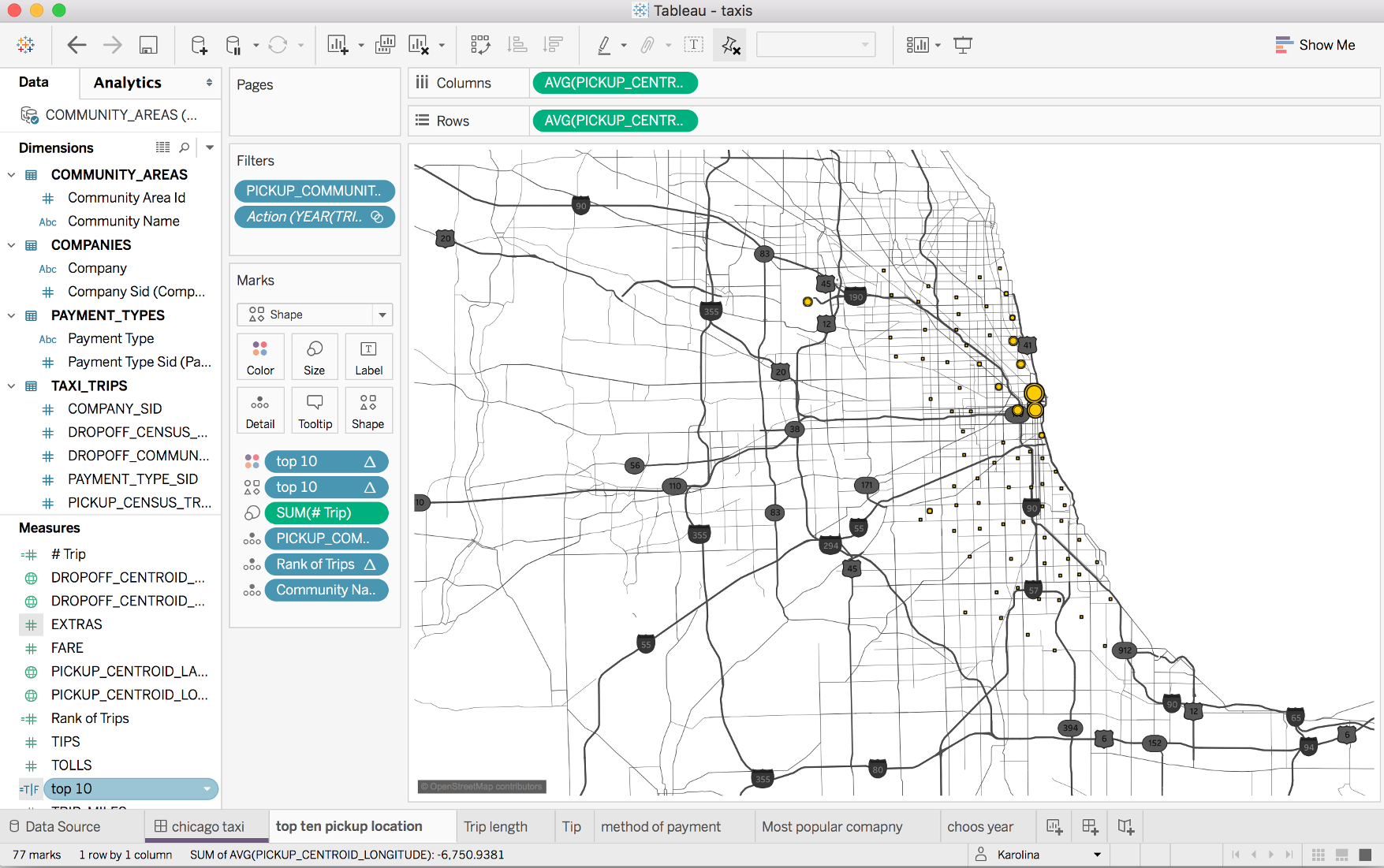
Tableau has a pretty good map functionality. It’s great but still slightly limited. Only the US region has the most detailed built-in maps. But there’s an option to use a custom geocoding, add own map layers should you want to.
The recently released version 10.2 (28 Feb 17) comes with much improved geo-mapping capabilities. I’m eager to upgrade and take it for a spin.
The dashboards are highly interactive and it makes the data presented very visually attractive.

The only downside of Tableau is that it doesn’t run on Linux and I use Linux as my main desktop.