Show me the numbers
“If the statistics are boring, then you’ve got the wrong numbers *” or the numbers are shown in the wrong way. I’ve been going through ‘Show me the numbers‘ book by Stephen Few. It’s a very enlightening read on data presentation techniques. The first chapter says that graphs should not be flashy but informative. Graphics need not dominate a presentation, but rather highlight the notable points.
I decided to makeover one of my earlier MakoverMondays dashboards and apply the guidelines.
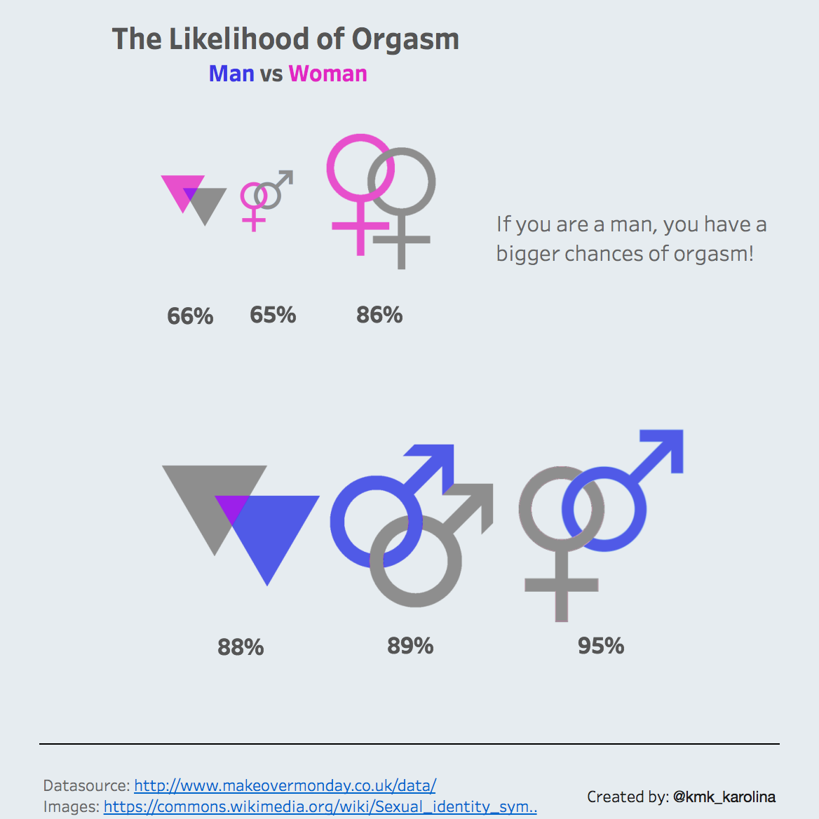
It was:
…and now, using waffle charts it looks like this:
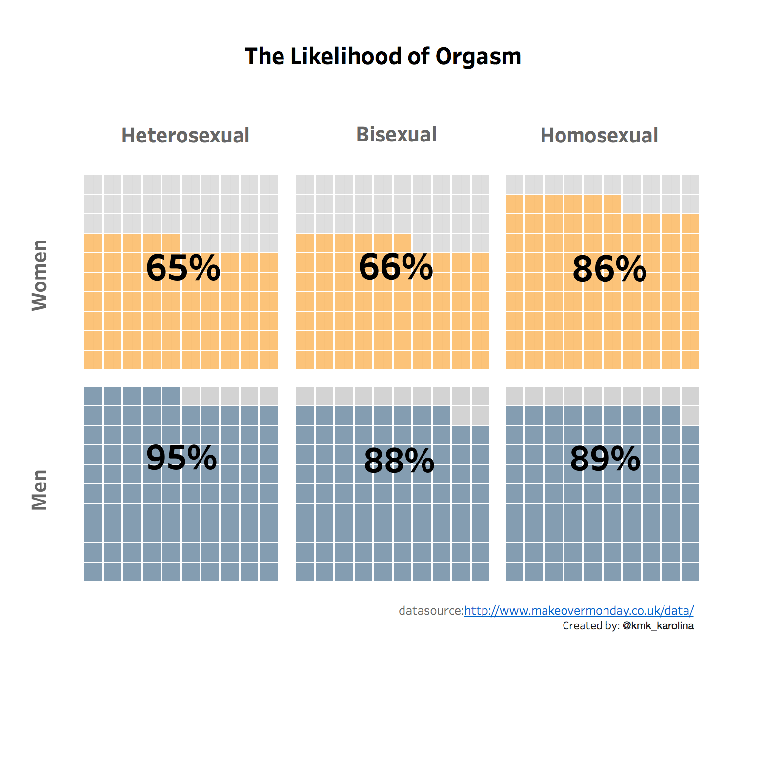
The waffle chart is nothing more but a square pie chart. I’m aware it’s a bit controversial topic (more on this here), but in some cases provides a nice visual way of communicating percentages.
Charts like these are a form of communication, but the chart must be comprehendible by those you are communicating with, be they senior management, your peers or the general public. In any group, the population is diverse, hence you should strive to appeal to all levels. I feel the second dashboard does the job much better now.
Conclusion: No matter how I show the numbers men are always better off 😉