Key Data Science

RSS
Mar
31

Déjà vu

I had a feeling of déjà vu when I saw this week’s Makeover Monday dashboard.

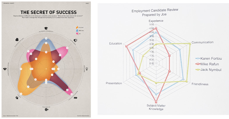
On the left, you have the Makeover Monday graph (http://visual.ly/secret-success) and on the right a graph from ‘Show me the numbers‘. The latter was used as a sample in the book to demonstrate how not to do visualisations.

I agree with the author that a spider chart is confusing. Often a simple solution like presenting the data in a table works better. I decided to experiment with two simple approaches and prepared a table and a bar chart.

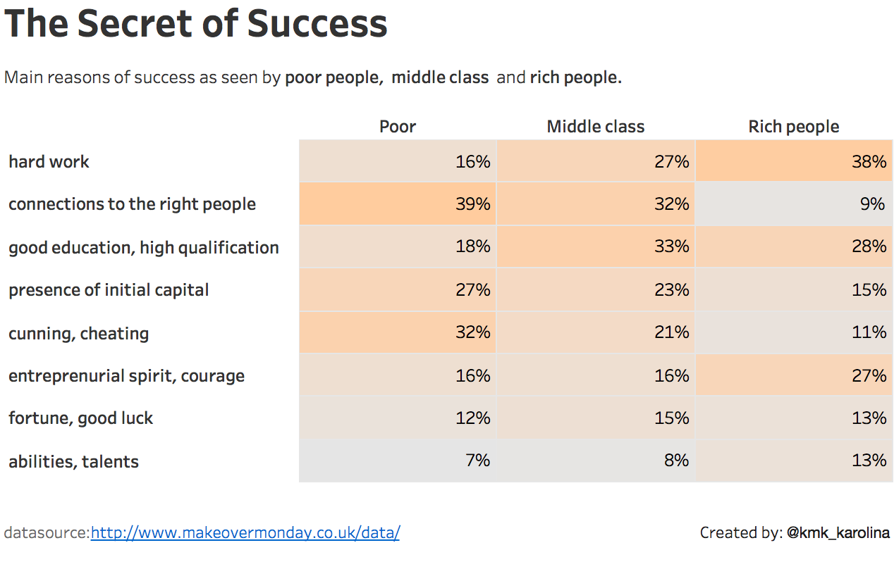
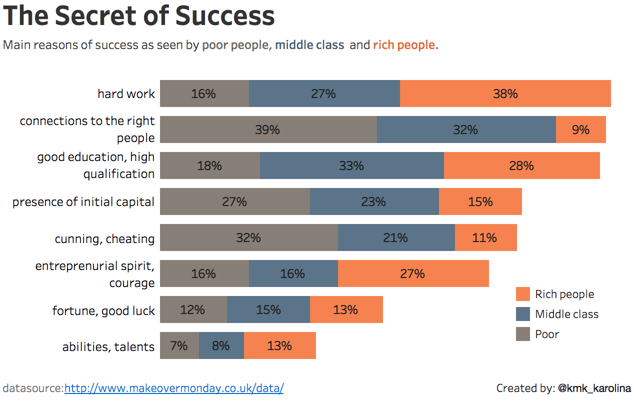
It’s now clear that both visualisations are much more readable than the spider graph.

Which one is better? Well, that’s up to you to decide.

Data Viz Comments Off on Déjà vu
Mar
21

Show me the numbers

If the statistics are boring, then you’ve got the wrong numbers *” or the numbers are shown in the wrong way. I’ve been going through ‘Show me the numbers‘ book by Stephen Few. It’s a very enlightening read on data presentation techniques. The first chapter says that graphs should not be flashy but informative. Graphics need not dominate a presentation, but rather highlight the notable points.

I decided to makeover one of my earlier MakoverMondays dashboards and apply the guidelines.

It was:

…and now, using waffle charts it looks like this:

The waffle chart is nothing more but a square pie chart. I’m aware it’s a bit controversial topic (more on this here), but in some cases provides a nice visual way of communicating percentages.

Charts like these are a form of communication, but the chart must be comprehendible by those you are communicating with, be they senior management, your peers or the general public. In any group, the population is diverse, hence you should strive to appeal to all levels. I feel the second dashboard does the job much better now.

Conclusion: No matter how I show the numbers men are always better off 😉

* Edward R. Tufte

Books, Data Viz Comments Off on Show me the numbers
Mar
15

Am I sexist?

We were riding on a chairlift when my other half noticed that there’s still quite a lot of people out there skiing or snowboarding without a helmet. My first reaction was: “Yes and look, most of them are men!”

But after having a second look (down), I pondered: Is it more men not wearing helmets or is it just because there are fewer women on the slopes?

After a cracking day, going up and down the mountain, that evening I sat down with a glass of wine and did some serious digging. On the SkiClub website I found a consumer research paper on snowsports with some interesting data. SkiClub is the biggest membership-based snowsports club in the UK.

Well, it doesn’t look good – there is indeed fewer women on the slopes, and the numbers are falling. As for the helmets, different sources provide slightly different numbers – from 64% to 88% of people on the slopes ride with a helmet. For this exercise, I settled on the 80% figure which seems representative.

Great, so it looks I’m not sexist after all! Without taking into account other factors (age, gender differences, risk-taking behaviour, etc.), it’s simply because there are more men on the slopes. This makes men more like likely to be spotted without a helmet.

Statistics, Tableau , , , Comments Off on Am I sexist?