Data Visualisation Tools
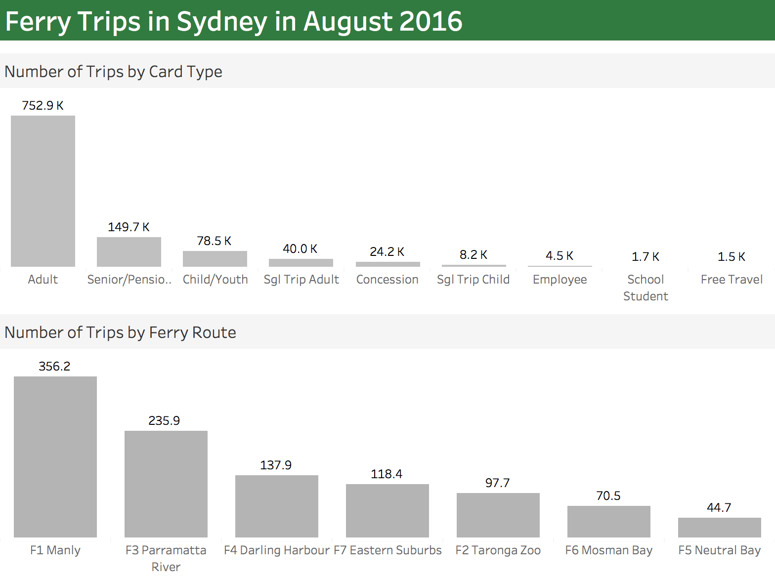
On my return flight from the data driven holidays, I looked into the next Makeover Monday challenge. It was about Sydney ferries and I did a small Tableau dashboard which was meant to look like a ferry announcement poster.
See it for yourself here.
Once I got that out of my way I wondered how easy it would be to accomplish a similar task in other data visualisation tools out there (it was a 4 hours flight so 3.5 hours to spare). I had all the other tools on my laptop so why not turn whatever it is into tasks and get crackin’!
Tableau
I decided to create a second and simpler dashboard in Tableau that could be used as a baseline. It took me only 5 minutes to complete.

Power BI
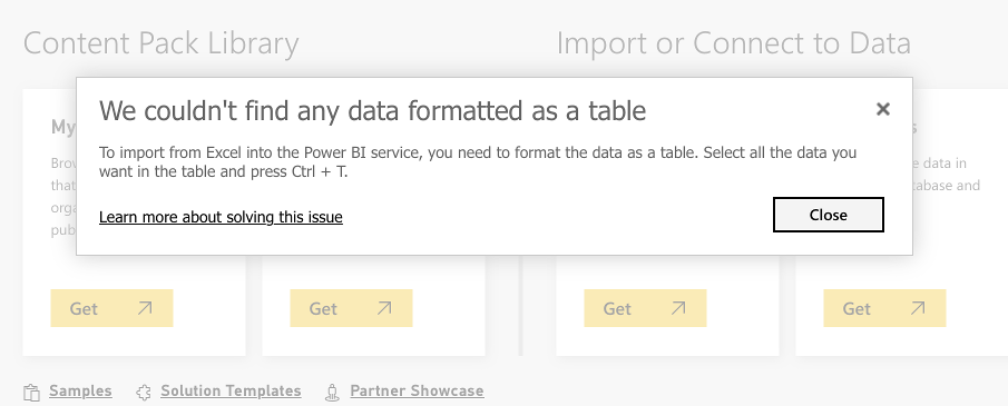
Next step was to recreate it in Power BI (using the data provided for the Makeover Monday in an Excel file). Well, things got off to a bad start. I immediately run into a problem when trying to upload the excel file to Power BI:

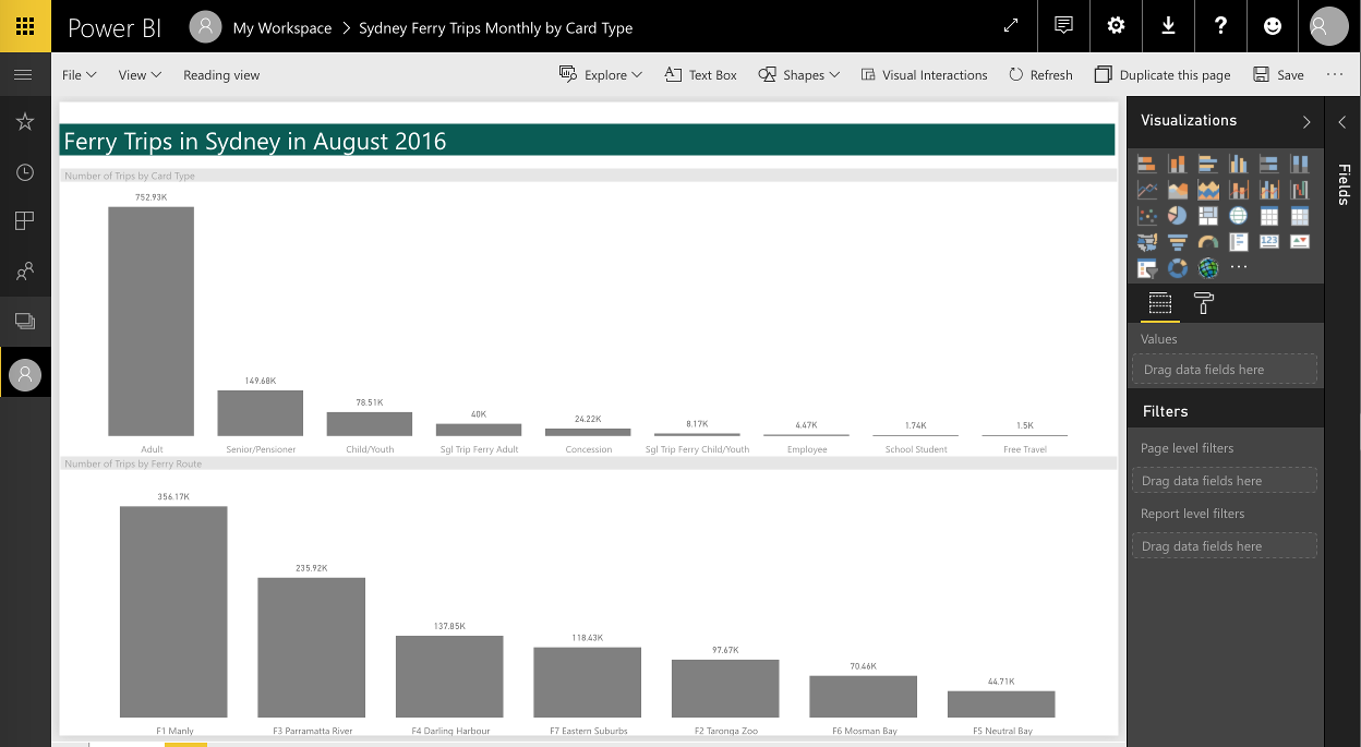
Nothing major but it looks like the data has to be formatted with a table style in Excel. Not very practical and confusing to users. With the style, format corrected the second attempt was indeed successful. Creating a copy of the first dashboard was a straightforward task and took me less than 10 minutes (including the formatting). That’s not bad for a tool which I don’t use very often.

I have a free version but the visualisation capabilities are exactly same as in the pro version. The main differences are in the data refresh and collaboration capabilities. Although my sample dashboard was a basic one you can create more complex reports as shown here.
While ago I had to use a REST API as the data source for Power BI. Surprisingly it did work. I used the desktop Power BI but run into some interesting authentication issues as the tool failed to pick up the authentication cookie. I resolved the problem with a custom HTTP header jiggery–pokery. Personally, I would prefer something that gives you a way to write a custom authentication script instead.
All in all, I think it’s a nice tool for ad-hoc data visualisations. If you have loads of Excel and CSV files flying around and want to do something with these quickly it’s definitely the right choice. If you want something more complicated – well you will quickly run into multiple snags.
QuickSight
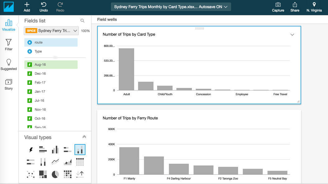
The last data visualisation tool I had in mind was Amazon QuickSight. It’s been available from mid-November 2016. I attempted to recreate the same dashboard again. I imported the CSV file into QS. This time it took me a bit longer complete. I gave myself 30 minutes which is a lot for a quick and easy dashboard like this one. I used all the allocated time stubbornly trying (and failing) to achieve the same look and feel.

QuickSight is a new kid on the block and there’s plenty of things that could be improved in terms of visualisation and formatting. I wasn’t able to figure out how to add labels to bars in 30 minutes which shows that the tool is not the most user-friendly. Also, I could not find out how to remove the grid lines in the rows. I hope that similar problems will be fixed and improved in the future versions.
I think the biggest selling point is the speed at which the BI can be brought to end user. It took me less than 5 minutes to start it and load the data. Another benefit is a good integration with other Amazon services like S3 or Redshift. As everything on Amazon, it can scale easily and scale fast. The pricing is also sensible.
All in all, it seems like a good tool for a quick and not too complicated visualisation. As for more advanced things I am not too sure yet. Well, I still have a couple of days left in the free trial so I’m going do something more challenging next time and report back.
